Data display
Mockup
A browser or window frame around a screenshot, a video or any content.
| Class name | Type | Description |
|---|---|---|
mockup-browserplf:mockup-browser | Component | A browser frame with an address bar |
mockup-windowplf:mockup-window | Component | A compact window frame with the three dots only |
mockup-browser-toolbarplf:mockup-browser-toolbar | Part | The bar with the three dots |
mockup-browser-urlplf:mockup-browser-url | Part | The address, after its lock or an icon of yours |
mockup-browser-sizesplf:mockup-browser-sizes | Part | Viewport sizes at the end of the bar: radios with the values desktop, tablet and phone, each drawn with its icon |
Browser
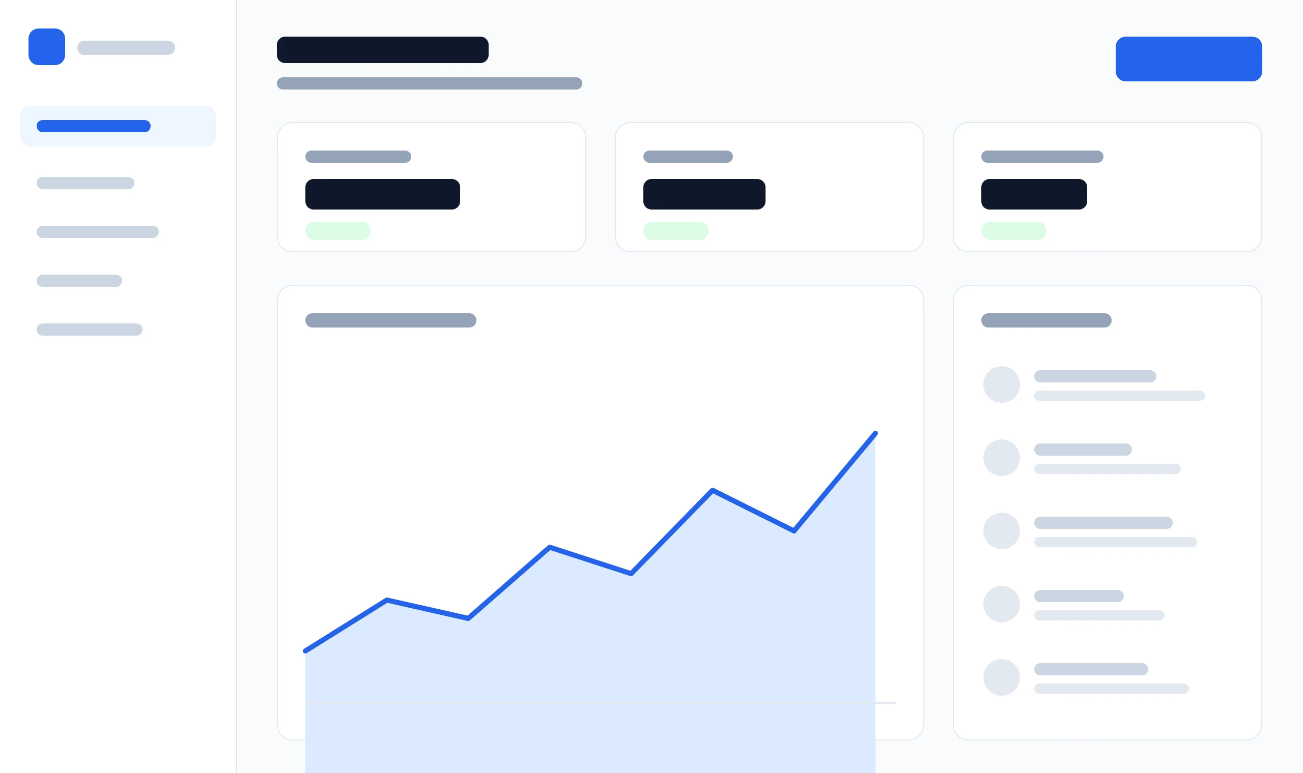
Give the screenshot a meaningful alt. The frame fills the width of its container and grows with its content; a long address ends in an ellipsis.
<div class="mockup-browser">
  <div class="mockup-browser-toolbar">
    <div class="mockup-browser-url">example.com</div>
  </div>
  <img src="/previews/assets/mockup-dashboard.webp" width="2560" height="1520" alt="Dashboard with sales figures, a revenue chart and recent customers">
</div><div class="plf:mockup-browser">
<div class="plf:mockup-browser-toolbar">
<div class="plf:mockup-browser-url">example.com</div>
</div>
<img src="/previews/assets/mockup-dashboard.webp" width="2560" height="1520" alt="Dashboard with sales figures, a revenue chart and recent customers">
</div>import { MockupBrowser, MockupBrowserToolbar, MockupBrowserUrl } from '@pelatform/react';
export function Example() {
return (
<MockupBrowser>
<MockupBrowserToolbar>
<MockupBrowserUrl>example.com</MockupBrowserUrl>
</MockupBrowserToolbar>
<img src="/previews/assets/mockup-dashboard.webp" width="2560" height="1520" alt="Dashboard with sales figures, a revenue chart and recent customers" />
</MockupBrowser>
);
}import { MockupBrowser, MockupBrowserToolbar, MockupBrowserUrl } from '@pelatform/react/prefixed';
export function Example() {
return (
<MockupBrowser>
<MockupBrowserToolbar>
<MockupBrowserUrl>example.com</MockupBrowserUrl>
</MockupBrowserToolbar>
<img src="/previews/assets/mockup-dashboard.webp" width="2560" height="1520" alt="Dashboard with sales figures, a revenue chart and recent customers" />
</MockupBrowser>
);
}Window
A frame without an address, with a compact bar and corners that suit a small mockup on a landing page; a width utility such as max-w-sm sets its width. In either frame a direct image, picture, video or iframe fills the width at its own ratio: export a screenshot at twice the width it shows, so it is never enlarged, and give it width and height, so the frame keeps its room while it loads. A height set on an image or video crops it from the top rather than stretching it.
<div class="mockup-window max-w-sm mx-auto">
  <img src="/previews/assets/mockup-dashboard.webp" width="2560" height="1520" alt="Dashboard with sales figures, a revenue chart and recent customers">
</div><div class="plf:mockup-window plf:max-w-sm plf:mx-auto">
<img src="/previews/assets/mockup-dashboard.webp" width="2560" height="1520" alt="Dashboard with sales figures, a revenue chart and recent customers">
</div>import { MockupWindow } from '@pelatform/react';
export function Example() {
return (
<MockupWindow className="max-w-sm mx-auto">
<img src="/previews/assets/mockup-dashboard.webp" width="2560" height="1520" alt="Dashboard with sales figures, a revenue chart and recent customers" />
</MockupWindow>
);
}import { MockupWindow } from '@pelatform/react/prefixed';
export function Example() {
return (
<MockupWindow className="plf:max-w-sm plf:mx-auto">
<img src="/previews/assets/mockup-dashboard.webp" width="2560" height="1520" alt="Dashboard with sales figures, a revenue chart and recent customers" />
</MockupWindow>
);
}<div class="mockup-window max-w-md mx-auto">
<form class="grid gap-4 p-6">
<div class="field">
<label class="field-label" for="mockup-email">Email</label>
<input class="input" id="mockup-email" type="email" placeholder="name@example.com">
</div>
<button class="btn btn-primary">Continue</button>
</form>
</div><div class="plf:mockup-window plf:max-w-md plf:mx-auto">
<form class="plf:grid plf:gap-4 plf:p-6">
<div class="plf:field">
<label class="plf:field-label" for="mockup-email">Email</label>
<input class="plf:input" id="mockup-email" type="email" placeholder="name@example.com">
</div>
<button class="plf:btn plf:btn-primary">Continue</button>
</form>
</div>import { Button, Field, Input, MockupWindow } from '@pelatform/react';
export function Example() {
return (
<MockupWindow className="max-w-md mx-auto">
<form className="grid gap-4 p-6">
<Field label="Email">
<Input type="email" placeholder="name@example.com" />
</Field>
<Button color="primary">Continue</Button>
</form>
</MockupWindow>
);
}import { Button, Field, Input, MockupWindow } from '@pelatform/react/prefixed';
export function Example() {
return (
<MockupWindow className="plf:max-w-md plf:mx-auto">
<form className="plf:grid plf:gap-4 plf:p-6">
<Field label="Email">
<Input type="email" placeholder="name@example.com" />
</Field>
<Button color="primary">Continue</Button>
</form>
</MockupWindow>
);
}Viewport sizes
Radios in mockup-browser-sizes narrow the frame to a tablet’s or a phone’s width, with no script; a size wider than the frame’s container leaves it as it is. Below md (768px) the screen is that narrow already, so the sizes hide. A page in an iframe, as here, lays itself out for that width; an image scales down.
<div class="mockup-browser">
  <div class="mockup-browser-toolbar">
    <div class="mockup-browser-url">example.com</div>
    <div class="mockup-browser-sizes" role="radiogroup" aria-label="Viewport size">
      <label><input type="radio" name="viewport" value="desktop" aria-label="Desktop" checked></label>
      <label><input type="radio" name="viewport" value="tablet" aria-label="Tablet"></label>
      <label><input type="radio" name="viewport" value="phone" aria-label="Phone"></label>
    </div>
  </div>
  <iframe class="h-96" src="/blocks/application-shell/preview/" title="Application shell"></iframe>
</div><div class="plf:mockup-browser">
<div class="plf:mockup-browser-toolbar">
<div class="plf:mockup-browser-url">example.com</div>
<div class="plf:mockup-browser-sizes" role="radiogroup" aria-label="Viewport size">
<label><input type="radio" name="viewport" value="desktop" aria-label="Desktop" checked></label>
<label><input type="radio" name="viewport" value="tablet" aria-label="Tablet"></label>
<label><input type="radio" name="viewport" value="phone" aria-label="Phone"></label>
</div>
</div>
<iframe class="plf:h-96" src="/blocks/application-shell/preview/" title="Application shell"></iframe>
</div>import { MockupBrowser, MockupBrowserSizes, MockupBrowserToolbar, MockupBrowserUrl } from '@pelatform/react';
export function Example() {
return (
<MockupBrowser>
<MockupBrowserToolbar>
<MockupBrowserUrl>example.com</MockupBrowserUrl>
<MockupBrowserSizes>
<label><input type="radio" name="viewport" value="desktop" aria-label="Desktop" defaultChecked /></label>
<label><input type="radio" name="viewport" value="tablet" aria-label="Tablet" /></label>
<label><input type="radio" name="viewport" value="phone" aria-label="Phone" /></label>
</MockupBrowserSizes>
</MockupBrowserToolbar>
<iframe className="h-96" src="/blocks/application-shell/preview/" title="Application shell" />
</MockupBrowser>
);
}import { MockupBrowser, MockupBrowserSizes, MockupBrowserToolbar, MockupBrowserUrl } from '@pelatform/react/prefixed';
export function Example() {
return (
<MockupBrowser>
<MockupBrowserToolbar>
<MockupBrowserUrl>example.com</MockupBrowserUrl>
<MockupBrowserSizes>
<label><input type="radio" name="viewport" value="desktop" aria-label="Desktop" defaultChecked /></label>
<label><input type="radio" name="viewport" value="tablet" aria-label="Tablet" /></label>
<label><input type="radio" name="viewport" value="phone" aria-label="Phone" /></label>
</MockupBrowserSizes>
</MockupBrowserToolbar>
<iframe className="plf:h-96" src="/blocks/application-shell/preview/" title="Application shell" />
</MockupBrowser>
);
}React
MockupBrowser and MockupWindow from @pelatform/react render these frames.
| Prop | Values | Default |
|---|---|---|
icon |
On MockupBrowserUrl, an SVG or icon class of yours in place of the lock |
The drawn lock |
The browser’s parts are MockupBrowserToolbar, MockupBrowserUrl and MockupBrowserSizes, a radio group named Viewport size unless given another aria-label, around your radios; the props are a div’s own, className and ref included.
CSS variables
Override on a root or on a single frame. The browser’s bar, dots and corners get as compact as the window’s below sm (640px).
| Variable | Default |
|---|---|
--plf-mockup-radius |
--plf-radius-2xl (16px) on the browser; --plf-radius-xl (12px) on the window, and on the browser below sm |
--plf-mockup-border |
--plf-color-border-subtle, on the frame, the bar and the address |
--plf-mockup-shadow |
--plf-shadow-xl |
--plf-mockup-bg |
Elevated surface |
--plf-mockup-bar-bg |
--plf-color-surface-hover |
--plf-mockup-tablet-width, --plf-mockup-phone-width |
768px and 375px, the width of the page inside the frame for each size |
--plf-mockup-close, --plf-mockup-minimize, --plf-mockup-maximize |
--plf-red-500, --plf-amber-400 and --plf-green-500, the three dots |