Data display
Lightbox
Opens linked images in a full-screen viewer, one at a time or as a gallery, with captions, keys and swipes.
| Class name | Type | Description |
|---|---|---|
lightboxplf:lightbox | Component | The full-screen viewer the script adds |
lightbox-counterplf:lightbox-counter | Part | The image number the script adds |
lightbox-closeplf:lightbox-close | Part | The close button the script adds |
lightbox-imageplf:lightbox-image | Part | The full image the script adds |
lightbox-loadingplf:lightbox-loading | Part | The spinner the script shows while an image loads |
lightbox-errorplf:lightbox-error | Part | The message the script shows when an image cannot load |
lightbox-captionplf:lightbox-caption | Part | The caption the script adds from the image's alt text |
lightbox-controlplf:lightbox-control | Part | A round previous or next button the script adds |
lightbox-control-previousplf:lightbox-control-previous | Modifier | The previous button |
lightbox-control-nextplf:lightbox-control-next | Modifier | The next button |

<a href="/previews/assets/gallery-beach.svg" data-plf-lightbox>
  <img class="rounded-xl" src="/previews/assets/gallery-beach.svg" alt="A palm tree on a sunny beach" width="240" height="240">
</a><a href="/previews/assets/gallery-beach.svg" data-plf-lightbox>
<img class="plf:rounded-xl" src="/previews/assets/gallery-beach.svg" alt="A palm tree on a sunny beach" width="240" height="240">
</a>import { Lightbox, LightboxLink } from '@pelatform/react';
export function Example() {
return (
<Lightbox>
<LightboxLink href="/previews/assets/gallery-beach.svg">
<img className="rounded-xl" src="/previews/assets/gallery-beach.svg" alt="A palm tree on a sunny beach" width="240" height="240" />
</LightboxLink>
</Lightbox>
);
}import { Lightbox, LightboxLink } from '@pelatform/react/prefixed';
export function Example() {
return (
<Lightbox>
<LightboxLink href="/previews/assets/gallery-beach.svg">
<img className="plf:rounded-xl" src="/previews/assets/gallery-beach.svg" alt="A palm tree on a sunny beach" width="240" height="240" />
</LightboxLink>
</Lightbox>
);
}


<div class="grid grid-cols-3 gap-2 max-w-md" data-plf-lightbox>
  <a href="/previews/assets/gallery-beach.svg">
    <img class="block w-full rounded-lg" src="/previews/assets/gallery-beach.svg" alt="A palm tree on a sunny beach">
  </a>
  <a href="/previews/assets/gallery-forest.svg">
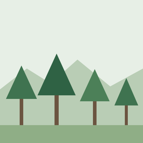
    <img class="block w-full rounded-lg" src="/previews/assets/gallery-forest.svg" alt="Pine trees below green hills">
  </a>
  <a href="/previews/assets/gallery-city.svg">
    <img class="block w-full rounded-lg" src="/previews/assets/gallery-city.svg" alt="City towers at sunset">
  </a>
  <a href="/previews/assets/gallery-desert.svg">
    <img class="block w-full rounded-lg" src="/previews/assets/gallery-desert.svg" alt="Desert dunes">
  </a>
  <a href="/previews/assets/gallery-garden.svg">
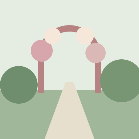
    <img class="block w-full rounded-lg" src="/previews/assets/gallery-garden.svg" alt="A garden in bloom">
  </a>
  <a href="/previews/assets/gallery-venue.svg">
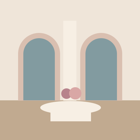
    <img class="block w-full rounded-lg" src="/previews/assets/gallery-venue.svg" alt="An event venue">
  </a>
</div><div class="plf:grid plf:grid-cols-3 plf:gap-2 plf:max-w-md" data-plf-lightbox>
<a href="/previews/assets/gallery-beach.svg">
<img class="plf:block plf:w-full plf:rounded-lg" src="/previews/assets/gallery-beach.svg" alt="A palm tree on a sunny beach">
</a>
<a href="/previews/assets/gallery-forest.svg">
<img class="plf:block plf:w-full plf:rounded-lg" src="/previews/assets/gallery-forest.svg" alt="Pine trees below green hills">
</a>
<a href="/previews/assets/gallery-city.svg">
<img class="plf:block plf:w-full plf:rounded-lg" src="/previews/assets/gallery-city.svg" alt="City towers at sunset">
</a>
<a href="/previews/assets/gallery-desert.svg">
<img class="plf:block plf:w-full plf:rounded-lg" src="/previews/assets/gallery-desert.svg" alt="Desert dunes">
</a>
<a href="/previews/assets/gallery-garden.svg">
<img class="plf:block plf:w-full plf:rounded-lg" src="/previews/assets/gallery-garden.svg" alt="A garden in bloom">
</a>
<a href="/previews/assets/gallery-venue.svg">
<img class="plf:block plf:w-full plf:rounded-lg" src="/previews/assets/gallery-venue.svg" alt="An event venue">
</a>
</div>import { Lightbox, LightboxLink } from '@pelatform/react';
export function Example() {
return (
<Lightbox>
<div className="grid grid-cols-3 gap-2 max-w-md">
<LightboxLink href="/previews/assets/gallery-beach.svg">
<img className="block w-full rounded-lg" src="/previews/assets/gallery-beach.svg" alt="A palm tree on a sunny beach" />
</LightboxLink>
<LightboxLink href="/previews/assets/gallery-forest.svg">
<img className="block w-full rounded-lg" src="/previews/assets/gallery-forest.svg" alt="Pine trees below green hills" />
</LightboxLink>
<LightboxLink href="/previews/assets/gallery-city.svg">
<img className="block w-full rounded-lg" src="/previews/assets/gallery-city.svg" alt="City towers at sunset" />
</LightboxLink>
<LightboxLink href="/previews/assets/gallery-desert.svg">
<img className="block w-full rounded-lg" src="/previews/assets/gallery-desert.svg" alt="Desert dunes" />
</LightboxLink>
<LightboxLink href="/previews/assets/gallery-garden.svg">
<img className="block w-full rounded-lg" src="/previews/assets/gallery-garden.svg" alt="A garden in bloom" />
</LightboxLink>
<LightboxLink href="/previews/assets/gallery-venue.svg">
<img className="block w-full rounded-lg" src="/previews/assets/gallery-venue.svg" alt="An event venue" />
</LightboxLink>
</div>
</Lightbox>
);
}import { Lightbox, LightboxLink } from '@pelatform/react/prefixed';
export function Example() {
return (
<Lightbox>
<div className="plf:grid plf:grid-cols-3 plf:gap-2 plf:max-w-md">
<LightboxLink href="/previews/assets/gallery-beach.svg">
<img className="plf:block plf:w-full plf:rounded-lg" src="/previews/assets/gallery-beach.svg" alt="A palm tree on a sunny beach" />
</LightboxLink>
<LightboxLink href="/previews/assets/gallery-forest.svg">
<img className="plf:block plf:w-full plf:rounded-lg" src="/previews/assets/gallery-forest.svg" alt="Pine trees below green hills" />
</LightboxLink>
<LightboxLink href="/previews/assets/gallery-city.svg">
<img className="plf:block plf:w-full plf:rounded-lg" src="/previews/assets/gallery-city.svg" alt="City towers at sunset" />
</LightboxLink>
<LightboxLink href="/previews/assets/gallery-desert.svg">
<img className="plf:block plf:w-full plf:rounded-lg" src="/previews/assets/gallery-desert.svg" alt="Desert dunes" />
</LightboxLink>
<LightboxLink href="/previews/assets/gallery-garden.svg">
<img className="plf:block plf:w-full plf:rounded-lg" src="/previews/assets/gallery-garden.svg" alt="A garden in bloom" />
</LightboxLink>
<LightboxLink href="/previews/assets/gallery-venue.svg">
<img className="plf:block plf:w-full plf:rounded-lg" src="/previews/assets/gallery-venue.svg" alt="An event venue" />
</LightboxLink>
</div>
</Lightbox>
);
}Open from a script
Hidden links still join the gallery: three photos show, and the script’s open() opens all six from the first; open(index) starts at another.
<div class="flex flex-col items-start gap-3">
  <div class="grid grid-cols-3 gap-2 max-w-md" id="venue-photos" data-plf-lightbox>
    <a href="/previews/assets/gallery-venue.svg">
      <img class="block w-full rounded-lg" src="/previews/assets/gallery-venue.svg" alt="An event venue">
    </a>
    <a href="/previews/assets/gallery-garden.svg">
      <img class="block w-full rounded-lg" src="/previews/assets/gallery-garden.svg" alt="A garden in bloom">
    </a>
    <a href="/previews/assets/gallery-city.svg">
      <img class="block w-full rounded-lg" src="/previews/assets/gallery-city.svg" alt="City towers at sunset">
    </a>
    <a href="/previews/assets/gallery-beach.svg" hidden>
      <img class="block w-full rounded-lg" src="/previews/assets/gallery-beach.svg" alt="A palm tree on a sunny beach" loading="lazy">
    </a>
    <a href="/previews/assets/gallery-forest.svg" hidden>
      <img class="block w-full rounded-lg" src="/previews/assets/gallery-forest.svg" alt="Pine trees below green hills" loading="lazy">
    </a>
    <a href="/previews/assets/gallery-desert.svg" hidden>
      <img class="block w-full rounded-lg" src="/previews/assets/gallery-desert.svg" alt="Desert dunes" loading="lazy">
    </a>
  </div>
  <button class="btn btn-outline" id="venue-photos-open">View all 6 photos</button>
</div>
<script>
  document.getElementById('venue-photos-open').addEventListener('click', () => {
    PLF.Lightbox.getOrCreateInstance(document.getElementById('venue-photos')).open();
  });
</script><div class="plf:flex plf:flex-col plf:items-start plf:gap-3">
<div class="plf:grid plf:grid-cols-3 plf:gap-2 plf:max-w-md" id="venue-photos" data-plf-lightbox>
<a href="/previews/assets/gallery-venue.svg">
<img class="plf:block plf:w-full plf:rounded-lg" src="/previews/assets/gallery-venue.svg" alt="An event venue">
</a>
<a href="/previews/assets/gallery-garden.svg">
<img class="plf:block plf:w-full plf:rounded-lg" src="/previews/assets/gallery-garden.svg" alt="A garden in bloom">
</a>
<a href="/previews/assets/gallery-city.svg">
<img class="plf:block plf:w-full plf:rounded-lg" src="/previews/assets/gallery-city.svg" alt="City towers at sunset">
</a>
<a href="/previews/assets/gallery-beach.svg" hidden>
<img class="plf:block plf:w-full plf:rounded-lg" src="/previews/assets/gallery-beach.svg" alt="A palm tree on a sunny beach" loading="lazy">
</a>
<a href="/previews/assets/gallery-forest.svg" hidden>
<img class="plf:block plf:w-full plf:rounded-lg" src="/previews/assets/gallery-forest.svg" alt="Pine trees below green hills" loading="lazy">
</a>
<a href="/previews/assets/gallery-desert.svg" hidden>
<img class="plf:block plf:w-full plf:rounded-lg" src="/previews/assets/gallery-desert.svg" alt="Desert dunes" loading="lazy">
</a>
</div>
<button class="plf:btn plf:btn-outline" id="venue-photos-open">View all 6 photos</button>
</div>
<script>
document.getElementById('venue-photos-open').addEventListener('click', () => {
PLF.Lightbox.getOrCreateInstance(document.getElementById('venue-photos')).open();
});
</script>'use client';
import { useState } from 'react';
import { Button, Lightbox, LightboxLink } from '@pelatform/react';
export function Example() {
const [open, setOpen] = useState(false);
return (
<div className="flex flex-col items-start gap-3">
<Lightbox open={open} onOpenChange={setOpen}>
<div className="grid grid-cols-3 gap-2 max-w-md">
<LightboxLink href="/previews/assets/gallery-venue.svg">
<img className="block w-full rounded-lg" src="/previews/assets/gallery-venue.svg" alt="An event venue" />
</LightboxLink>
<LightboxLink href="/previews/assets/gallery-garden.svg">
<img className="block w-full rounded-lg" src="/previews/assets/gallery-garden.svg" alt="A garden in bloom" />
</LightboxLink>
<LightboxLink href="/previews/assets/gallery-city.svg">
<img className="block w-full rounded-lg" src="/previews/assets/gallery-city.svg" alt="City towers at sunset" />
</LightboxLink>
<LightboxLink href="/previews/assets/gallery-beach.svg" hidden>
<img className="block w-full rounded-lg" src="/previews/assets/gallery-beach.svg" alt="A palm tree on a sunny beach" loading="lazy" />
</LightboxLink>
<LightboxLink href="/previews/assets/gallery-forest.svg" hidden>
<img className="block w-full rounded-lg" src="/previews/assets/gallery-forest.svg" alt="Pine trees below green hills" loading="lazy" />
</LightboxLink>
<LightboxLink href="/previews/assets/gallery-desert.svg" hidden>
<img className="block w-full rounded-lg" src="/previews/assets/gallery-desert.svg" alt="Desert dunes" loading="lazy" />
</LightboxLink>
</div>
</Lightbox>
<Button variant="outline" onClick={() => setOpen(true)}>View all 6 photos</Button>
</div>
);
}'use client';
import { useState } from 'react';
import { Button, Lightbox, LightboxLink } from '@pelatform/react/prefixed';
export function Example() {
const [open, setOpen] = useState(false);
return (
<div className="plf:flex plf:flex-col plf:items-start plf:gap-3">
<Lightbox open={open} onOpenChange={setOpen}>
<div className="plf:grid plf:grid-cols-3 plf:gap-2 plf:max-w-md">
<LightboxLink href="/previews/assets/gallery-venue.svg">
<img className="plf:block plf:w-full plf:rounded-lg" src="/previews/assets/gallery-venue.svg" alt="An event venue" />
</LightboxLink>
<LightboxLink href="/previews/assets/gallery-garden.svg">
<img className="plf:block plf:w-full plf:rounded-lg" src="/previews/assets/gallery-garden.svg" alt="A garden in bloom" />
</LightboxLink>
<LightboxLink href="/previews/assets/gallery-city.svg">
<img className="plf:block plf:w-full plf:rounded-lg" src="/previews/assets/gallery-city.svg" alt="City towers at sunset" />
</LightboxLink>
<LightboxLink href="/previews/assets/gallery-beach.svg" hidden>
<img className="plf:block plf:w-full plf:rounded-lg" src="/previews/assets/gallery-beach.svg" alt="A palm tree on a sunny beach" loading="lazy" />
</LightboxLink>
<LightboxLink href="/previews/assets/gallery-forest.svg" hidden>
<img className="plf:block plf:w-full plf:rounded-lg" src="/previews/assets/gallery-forest.svg" alt="Pine trees below green hills" loading="lazy" />
</LightboxLink>
<LightboxLink href="/previews/assets/gallery-desert.svg" hidden>
<img className="plf:block plf:w-full plf:rounded-lg" src="/previews/assets/gallery-desert.svg" alt="Desert dunes" loading="lazy" />
</LightboxLink>
</div>
</Lightbox>
<Button variant="outline" onClick={() => setOpen(true)}>View all 6 photos</Button>
</div>
);
}<section class="carousel" data-plf-carousel data-plf-lightbox aria-label="Sample photos">
<div class="carousel-viewport">
<div class="carousel-track" data-plf-carousel-track tabindex="0">
<div class="carousel-item">
<a href="/previews/assets/gallery-beach.svg">
<img class="carousel-media" src="/previews/assets/gallery-beach.svg" alt="A palm tree on a sunny beach">
</a>
</div>
<div class="carousel-item">
<a href="/previews/assets/gallery-forest.svg">
<img class="carousel-media" src="/previews/assets/gallery-forest.svg" alt="Pine trees below green hills">
</a>
</div>
<div class="carousel-item">
<a href="/previews/assets/gallery-city.svg">
<img class="carousel-media" src="/previews/assets/gallery-city.svg" alt="City towers at sunset">
</a>
</div>
</div>
<button class="carousel-control carousel-control-previous" data-plf-carousel-previous hidden></button>
<button class="carousel-control carousel-control-next" data-plf-carousel-next hidden></button>
</div>
<div class="carousel-footer">
<div class="carousel-indicators" data-plf-carousel-indicators hidden></div>
</div>
</section><section class="plf:carousel" data-plf-carousel data-plf-lightbox aria-label="Sample photos">
<div class="plf:carousel-viewport">
<div class="plf:carousel-track" data-plf-carousel-track tabindex="0">
<div class="plf:carousel-item">
<a href="/previews/assets/gallery-beach.svg">
<img class="plf:carousel-media" src="/previews/assets/gallery-beach.svg" alt="A palm tree on a sunny beach">
</a>
</div>
<div class="plf:carousel-item">
<a href="/previews/assets/gallery-forest.svg">
<img class="plf:carousel-media" src="/previews/assets/gallery-forest.svg" alt="Pine trees below green hills">
</a>
</div>
<div class="plf:carousel-item">
<a href="/previews/assets/gallery-city.svg">
<img class="plf:carousel-media" src="/previews/assets/gallery-city.svg" alt="City towers at sunset">
</a>
</div>
</div>
<button class="plf:carousel-control plf:carousel-control-previous" data-plf-carousel-previous hidden></button>
<button class="plf:carousel-control plf:carousel-control-next" data-plf-carousel-next hidden></button>
</div>
<div class="plf:carousel-footer">
<div class="plf:carousel-indicators" data-plf-carousel-indicators hidden></div>
</div>
</section>import {
Carousel, CarouselFooter, CarouselIndicators, CarouselItem, CarouselNext, CarouselPrevious, CarouselTrack, CarouselViewport,
Lightbox, LightboxLink,
} from '@pelatform/react';
export function Example() {
return (
<Lightbox>
<Carousel aria-label="Sample photos">
<CarouselViewport>
<CarouselTrack>
<CarouselItem>
<LightboxLink href="/previews/assets/gallery-beach.svg">
<img className="carousel-media" src="/previews/assets/gallery-beach.svg" alt="A palm tree on a sunny beach" />
</LightboxLink>
</CarouselItem>
<CarouselItem>
<LightboxLink href="/previews/assets/gallery-forest.svg">
<img className="carousel-media" src="/previews/assets/gallery-forest.svg" alt="Pine trees below green hills" />
</LightboxLink>
</CarouselItem>
<CarouselItem>
<LightboxLink href="/previews/assets/gallery-city.svg">
<img className="carousel-media" src="/previews/assets/gallery-city.svg" alt="City towers at sunset" />
</LightboxLink>
</CarouselItem>
</CarouselTrack>
<CarouselPrevious />
<CarouselNext />
</CarouselViewport>
<CarouselFooter>
<CarouselIndicators />
</CarouselFooter>
</Carousel>
</Lightbox>
);
}import {
Carousel, CarouselFooter, CarouselIndicators, CarouselItem, CarouselNext, CarouselPrevious, CarouselTrack, CarouselViewport,
Lightbox, LightboxLink,
} from '@pelatform/react/prefixed';
export function Example() {
return (
<Lightbox>
<Carousel aria-label="Sample photos">
<CarouselViewport>
<CarouselTrack>
<CarouselItem>
<LightboxLink href="/previews/assets/gallery-beach.svg">
<img className="plf:carousel-media" src="/previews/assets/gallery-beach.svg" alt="A palm tree on a sunny beach" />
</LightboxLink>
</CarouselItem>
<CarouselItem>
<LightboxLink href="/previews/assets/gallery-forest.svg">
<img className="plf:carousel-media" src="/previews/assets/gallery-forest.svg" alt="Pine trees below green hills" />
</LightboxLink>
</CarouselItem>
<CarouselItem>
<LightboxLink href="/previews/assets/gallery-city.svg">
<img className="plf:carousel-media" src="/previews/assets/gallery-city.svg" alt="City towers at sunset" />
</LightboxLink>
</CarouselItem>
</CarouselTrack>
<CarouselPrevious />
<CarouselNext />
</CarouselViewport>
<CarouselFooter>
<CarouselIndicators />
</CarouselFooter>
</Carousel>
</Lightbox>
);
}JavaScript
Lightbox needs JavaScript. Without it, and inside an open Modal, where dialogs do not stack, each link opens its image itself. The Full script (pelatform-ui.min.js) starts every component on page load, with no code of your own; with ESM imports, call init() yourself, as in Installation. For markup you add later, see Dynamic content.
<link rel="stylesheet" href="pelatform-ui.min.css">
<script src="pelatform-ui.min.js" defer></script><link rel="stylesheet" href="core/pelatform-ui-core.min.css">
<link rel="stylesheet" href="components/button.min.css">
<link rel="stylesheet" href="components/modal.min.css">
<link rel="stylesheet" href="components/spinner.min.css">
<link rel="stylesheet" href="components/carousel.min.css">
<link rel="stylesheet" href="components/lightbox.min.css">
<script src="core/pelatform-ui-core.min.js" defer></script>
<script src="components/modal.min.js" defer></script>
<script src="components/carousel.min.js" defer></script>
<script src="components/lightbox.min.js" defer></script>
<script>document.addEventListener('DOMContentLoaded', () => PLF.init());</script><link rel="stylesheet" href="pelatform-ui.prefixed.min.css">
<script src="pelatform-ui.min.js" defer></script><link rel="stylesheet" href="core/pelatform-ui-core.prefixed.min.css">
<link rel="stylesheet" href="components/button.prefixed.min.css">
<link rel="stylesheet" href="components/modal.prefixed.min.css">
<link rel="stylesheet" href="components/spinner.prefixed.min.css">
<link rel="stylesheet" href="components/carousel.prefixed.min.css">
<link rel="stylesheet" href="components/lightbox.prefixed.min.css">
<script src="core/pelatform-ui-core.min.js" defer></script>
<script src="components/modal.min.js" defer></script>
<script src="components/carousel.min.js" defer></script>
<script src="components/lightbox.min.js" defer></script>
<script>document.addEventListener('DOMContentLoaded', () => PLF.init());</script>| Attribute | Purpose |
|---|---|
data-plf-lightbox |
On a link, opens its image in the viewer; on another element, its links that hold an <img>, hidden ones included, open as one gallery, in page order. Each caption is the image’s alt text, which every link needs |
data-plf-close-label, data-plf-previous-label, data-plf-next-label |
On the lightbox, the button names; Close, Previous image and Next image by default |
data-plf-counter-label |
What a screen reader hears after the caption; {index} of {count} by default |
data-plf-error-label, data-plf-open-label |
The message and its link when an image cannot load; The image could not load. and Open image by default |
| Method | Behavior |
|---|---|
PLF. |
Returns the instance, creating it for valid markup |
PLF. |
Returns the instance or null |
instance. |
Opens the viewer at an image, counted from 0 (the first by default), or shows it while open; false when it cannot open |
instance. |
Closes the viewer and gives focus back; false when it is not open |
instance., instance. |
Show the next or previous image, without wrapping |
instance. |
Returns {open, index, count} |
instance. |
Closes the viewer without events and removes listeners; the root’s last lightbox removes the viewer |
| Event | When |
|---|---|
plf: |
After the viewer opens |
plf: |
After the viewer shows another image |
plf: |
After the viewer closes |
Each event’s detail:
| Property | Events | Value |
|---|---|---|
instance |
All | The Lightbox instance |
index |
All | The index of the image shown, counted from 0 |
trigger |
All | The clicked link or button, or null from a key, a swipe, the backdrop or a method |
reason |
All | trigger for the link or the close button, previous, next, keyboard, swipe, backdrop or api |
previous |
change |
The index of the image shown before |
| Key | Action |
|---|---|
| Left Arrow, Right Arrow | Show the previous or next image; mirrored right to left |
| Home, End | Show the first or last image |
| Escape | Close the viewer |
| Tab, Shift+Tab | Move between the viewer’s buttons |
React
Lightbox from @pelatform/react renders its children, whose LightboxLinks open their images as one gallery in page order, then the viewer on a Modal: it keeps its own state, or the application opens it with open and sets the image with index.
| Prop | Values | Default |
|---|---|---|
open |
true while the viewer is open, which the application changes in onOpenChange |
Its own state |
onOpenChange |
(open, reason), called when a link opens the viewer (trigger) or the viewer asks to close: trigger (its close button), keyboard (Escape) or backdrop (a click beside the image) |
None |
index |
The image shown, from 0, which the application changes in onIndexChange |
Its own state: the clicked link’s image, or the first |
onIndexChange |
(index, reason), called when a link (trigger), a button (previous, next), a key (keyboard) or a swipe (swipe) shows another image |
None |
closeLabel, previousLabel, nextLabel |
The button names | Close, Previous image and Next image |
counterLabel |
(index, count), what a screen reader hears after the caption, with the image’s number from 1 |
{index} of {count} |
errorLabel, openLabel |
The message and its link when an image cannot load | The image could not load. and Open image |
The parts:
| Part | Element |
|---|---|
LightboxLink |
An a to the full image (href), captioned with its image’s alt text; a click opens the viewer at it, and a hidden one still joins the gallery |
The other props are the element’s own, className and ref included; Lightbox’s element is the viewer’s dialog.
CSS variables
Override on a root.
| Variable | Default |
|---|---|
--plf-lightbox-bg |
The dark theme’s surface (neutral-950) |
--plf-lightbox-color |
The dark theme’s text (neutral-50) |
--plf-lightbox-image-radius |
Extra large radius (12px) |